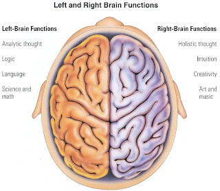
My friend, Sara, told me recently, that she depends mainly on graphical representations when learning for her CFA. The diagrams, and maps stay in her mind longer than words do. This would show the difference in the way she perceives information, vs. another, who might retain information another method.
LEFT BRAIN FUNCTIONS
uses logic
detail oriented
facts rule
words and language
present and past
math and science
can comprehend
knowing
acknowledges
order/pattern perception
knows object name
reality based
forms strategies
practical
safe
RIGHT BRAIN FUNCTIONS
uses feeling
"big picture" oriented
imagination rules
symbols and images
present and future
philosophy & religion
can "get it" (i.e. meaning)
believes
appreciates
spatial perception
knows object function
fantasy based
presents possibilities
impetuous
risk taking
IF I WAS HER PROFESSOR, HOW WOULD I WORK WITH SARA TO GAIN MAXIMUM RETENTION?
Verbal vs. Visual Elements
Ideas that preclude words are supported with pictures and graphs on the screen. To the eye your presentation will give information about shapes, colors, surface qualities, and spatial relationships. To the ear, your presentation will provide reasoning. The best technical talk is an effective mix of verbal and visual elements.
Illustrate what you cannot verbalize, what would take too long to describe, or what you want to emphasize. Use slides to hold attention, illustrate, clarify, restate, explain and interpret. Ears have trouble accepting numbers and abstractions. Numbers are easier to remember if they are written out. Quantities and relationships must be visually compared. By adding illustrations to your spoken words, you add understanding to what you are saying and enliven interest in your presentation.
• Animations
Make use of its dynamic capabilities to highlight different features, to indicate a chain of reasoning, to introduce successive levels of detail into an example, or to demonstrate the dynamic behavior of an algorithm.
• Maintain context
Never say one thing visually on the screen and something else orally. The mind can not readily accept such conflicting information even when both things are correct and related.
• Blank slides
Slides are an aid to your presentation and not the presentation itself. Avoid reading slides, keep your attention on the audience. Sometimes, you might wish to digress from the topic of the current slide but do not want the audience distracted by the next one. In this case, use a blank slide of a subdued color (dark color, no white).
• Prepare for the question period
Make a list of probable questions. This will help you to make a quick response. Some presenters even make up a slide or two for expected questions.
Nawal.
thanks for the guidelines, those are really helpful in the teaching field and could prove to be effective. thanks for the educational post!
ReplyDeleteNayla
Adding to the above, I think we can use the acronym in the teaching as well.
ReplyDeleteThnx to you.
Ahmed Yususf
Very interesting picture Nawal, I think your next post should be a picture of the difference in a Man and Woman's brain.
ReplyDeleteThat will be something ;)